Two Dimensional Design
Friday, May 4, 2012
Friday, April 27, 2012
Design for a Cause
I created the poster (below) using only color (no black or white)
My intention is to produce a design that communicates my message, using the elements of design that I've learned in this class.
My intention is to produce a design that communicates my message, using the elements of design that I've learned in this class.
Sunday, April 22, 2012
Color Wheel
Below is a color wheel, using primary, secondary and tertiary Hues.
This wheel also contains two complementary hue to hue scales:
Orange to Purple and Purple to Green
and One Hue (Orange) to White Value
This wheel also contains two complementary hue to hue scales:
Orange to Purple and Purple to Green
and One Hue (Orange) to White Value
Friday, April 20, 2012
Sunday, April 15, 2012
Tuesday, April 3, 2012
Illusionistic Motion
Below are some photographs by Gjon Mili, a photographer from the 1930’s who, like THomas Eakins, was fascinated with the study of motion through photography. Through the use of photoflash, he was able to capture a sequence of actions in one photograph.
The photo below, of Gene Kelly, shows illusionistic motion through the use of multiple images.
This of Gene Krupa depicts motion through the use of blurred outlines. The drawing on the right, by Edouard Manet, uses the same technique to portray motion. The sketchy drawing style suggests motion and the right arm and hoe are incomplete and overlapping, suggesting more motion than the rest of the body.
The picture below, another photograph by Gjon Mili, is an example of anticipated motion. This “unstable body positon” makes it clear to the viewer that “change is imminent,” although it doesn’t look like the person in the photo is concerned.
Saturday, March 31, 2012
Patterns and Texture
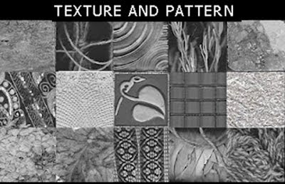
Below are 15 examples of texture from found objects around my house and yard.
From left to right:
Slate, string, carnival glass, dried spice, lace, marble,
cloth pocketbook, metal tile, 1" glass tiles, bubble wrap,
dried hydrangea, leaves, guitar strap, bundled sage, yarn.
Below is a grayscale image created from my texture samples.
The circle in the middle is 50% black.
From left to right:
Slate, string, carnival glass, dried spice, lace, marble,
cloth pocketbook, metal tile, 1" glass tiles, bubble wrap,
dried hydrangea, leaves, guitar strap, bundled sage, yarn.
Below is a grayscale image created from my texture samples.
The circle in the middle is 50% black.
Subscribe to:
Comments (Atom)


