
Friday, May 4, 2012
Friday, April 27, 2012
Design for a Cause
I created the poster (below) using only color (no black or white)
My intention is to produce a design that communicates my message, using the elements of design that I've learned in this class.

My intention is to produce a design that communicates my message, using the elements of design that I've learned in this class.

Sunday, April 22, 2012
Color Wheel
Below is a color wheel, using primary, secondary and tertiary Hues.
This wheel also contains two complementary hue to hue scales:
Orange to Purple and Purple to Green
and One Hue (Orange) to White Value

This wheel also contains two complementary hue to hue scales:
Orange to Purple and Purple to Green
and One Hue (Orange) to White Value

Friday, April 20, 2012

Sunday, April 15, 2012

Tuesday, April 3, 2012
Illusionistic Motion
Below are some photographs by Gjon Mili, a photographer from the 1930’s who, like THomas Eakins, was fascinated with the study of motion through photography. Through the use of photoflash, he was able to capture a sequence of actions in one photograph.
The photo below, of Gene Kelly, shows illusionistic motion through the use of multiple images.

This of Gene Krupa depicts motion through the use of blurred outlines. The drawing on the right, by Edouard Manet, uses the same technique to portray motion. The sketchy drawing style suggests motion and the right arm and hoe are incomplete and overlapping, suggesting more motion than the rest of the body.

The picture below, another photograph by Gjon Mili, is an example of anticipated motion. This “unstable body positon” makes it clear to the viewer that “change is imminent,” although it doesn’t look like the person in the photo is concerned.

Saturday, March 31, 2012
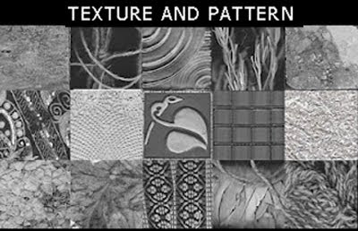
Patterns and Texture
Below are 15 examples of texture from found objects around my house and yard.
From left to right:
Slate, string, carnival glass, dried spice, lace, marble,
cloth pocketbook, metal tile, 1" glass tiles, bubble wrap,
dried hydrangea, leaves, guitar strap, bundled sage, yarn.
Below is a grayscale image created from my texture samples.
The circle in the middle is 50% black.

From left to right:
Slate, string, carnival glass, dried spice, lace, marble,
cloth pocketbook, metal tile, 1" glass tiles, bubble wrap,
dried hydrangea, leaves, guitar strap, bundled sage, yarn.

Below is a grayscale image created from my texture samples.
The circle in the middle is 50% black.

Wednesday, March 28, 2012
Texture Assignment
The first picture below is one from my selection of scanned textures. It's a piece of tile made out of carnival glass. The photo on the right is a watercolor painting which gives the illusion of glass.
I included the photograph of the ocean because it fits so well in the middle (visually). Both the glass tile and the watercolor painting look like they could be abstracts of the ocean photograph.
In addition, I like the progression of the pictures from left to right -- the wide sweeping monochromatic design of the tile to the slightly more colorful ocean photo to the much more colorful and tightly curved design of the watercolor painting.

Sunday, March 25, 2012


Tuesday, March 20, 2012
Shape/Volume Examples
Rectilinear
I chose this painting by Ivan Alexeevich Kudriashev, entitled Construction of a Rectilinear Motion as an example of Rectilinear art. The painting caught my eye because it so clearly represent an artwork created with straight edges, producing a sharp angular feeling. In addition, the placement of the shapes remind me of an object shooting across the sky, leaving a long vapor trail behind it, possibly because linear shapes and straight lines seem to depict fast motion.
Photo found here.

Curvilinear
I chose to display the typeface “Art Nouveau Bistro” because, as mentioned in the reading, art nouveau style emphasized curvilinear shapes.

Naturalistic
This painting by Edinelson Ramirez, of the Basin Harbor represents naturalistic art, because its aim is to represent the true-to-life visual appearance of the world around us.

Idealistic
This is debatable, but I chose these action figures as art that represents the world as it should be . . . (at least for the people that are playing with these action figures) and they are an exaggerated version of what many might consider an ideal look for a man -- muscular, fit, wearing little underpants and a cape . . ;-D

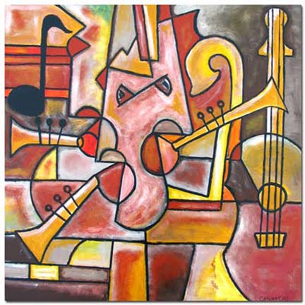
Abstract
This painting, Midnight Jazz”, represent Abstract art. I was interested to read that abstracttion if a simplification of natural shapes to their essential basic character. I am sure I’ve referred to many “non-objective” designs as abstract. I had not made the distinction between abstract being a distortion of something familiar, whereas non-objective refers to shapes with no object reference and no subject matter suggestion.

Non-Objective
This bracelet is an example of non-objective sculptural design. The artists’ goal is to make a mini-sculpture that can be worn.
Jewelry site here

I chose this painting by Ivan Alexeevich Kudriashev, entitled Construction of a Rectilinear Motion as an example of Rectilinear art. The painting caught my eye because it so clearly represent an artwork created with straight edges, producing a sharp angular feeling. In addition, the placement of the shapes remind me of an object shooting across the sky, leaving a long vapor trail behind it, possibly because linear shapes and straight lines seem to depict fast motion.
Photo found here.

Curvilinear
I chose to display the typeface “Art Nouveau Bistro” because, as mentioned in the reading, art nouveau style emphasized curvilinear shapes.

Naturalistic
This painting by Edinelson Ramirez, of the Basin Harbor represents naturalistic art, because its aim is to represent the true-to-life visual appearance of the world around us.

Idealistic
This is debatable, but I chose these action figures as art that represents the world as it should be . . . (at least for the people that are playing with these action figures) and they are an exaggerated version of what many might consider an ideal look for a man -- muscular, fit, wearing little underpants and a cape . . ;-D

Abstract
This painting, Midnight Jazz”, represent Abstract art. I was interested to read that abstracttion if a simplification of natural shapes to their essential basic character. I am sure I’ve referred to many “non-objective” designs as abstract. I had not made the distinction between abstract being a distortion of something familiar, whereas non-objective refers to shapes with no object reference and no subject matter suggestion.
Non-Objective
This bracelet is an example of non-objective sculptural design. The artists’ goal is to make a mini-sculpture that can be worn.
Jewelry site here

Monday, March 19, 2012


Saturday, March 17, 2012


Monday, March 12, 2012
Sunday, March 4, 2012


Saturday, February 25, 2012
Black and White Design
The design on the top is a design created from white shapes, which are outlines of kitchen objects. Not being able to change the scale of items or overlap them was challenging and I had a hard time coming up with a design. The design on the bottom is created by using the negative space from the first design. I ended up combining the black shapes in such a way that the design still looks like white on black. Or, white is prominent simply because it's the lighter color.


Sunday, February 19, 2012


Scale & Proportion
I chose Claes Oldenburg sculpture entitled, “Typewriter Eraser, Scale X” (page 76) as an example of scale and proportion to call attention to an object. Recreating an everyday object in monumental size can’t help but emphasize the object, calling the viewer in to take a closer look at a normal every day object.
Although we are not likely to come across a typewriter eraser in our typical day, I am interested in how this object, when reproduced so large, becomes a great design. I think it’s appropriate that the photo includes children, as the sculpture feels playful, probably by nature of the large circle and the use of 2 primary colors. As the text mentions, the average person would not notice the graceful strands of the brush if they were to look at this in its original size.
The photo below, on the right, taken by Melanie Einzig is another example of the power of unusual scale. The irony in the photograph is emphasized by “human scale reference”, especially when the human is not looking like he’s feeling very festive.

Friday, February 10, 2012
Emphasis and Focal Point
CONTRAST
Cimots Interior Design
This photo, from an Interior Design Website, shows and obvious contrasting color. My immediate focus is on the bright pink coffe table, a contrasting color from the rest of the items in the room.

ISOLATION
Ansel Adams
Like the example in our reading in the painting by Thomas Eakins, this photo by Ansel Adams has two light sources. The two faces are far enough apart to be considered isolated. I think the emphasis is on the face of Georgia O'Keeffe, which is lighter.
Georgia O’Keeffe and Orville Cox, Canyon de Chelly National Monument, Arizona - Ansel Adams

PLACEMENT
Melanie Einzig
 Although this is a busy photograph, I think it works. My eye is drawn to the sign on the bottom, then follows the curve on the statue of liberty’s arm, completing the curve created by the red window frame and down to the “horned hat” of the man on the right.
Street Photographer - Melanie Einzig
ONE ELEMENT
Frida Kahlo
Another busy painting with emphasis clearly on one element -- Frida, centered, large, pink dress.
Self-Portrait on the Border Line Between Mexico and the United States. 1932. Oil on metal 31.7 x 35 cm. -
Frida Kahlo

ABSENCE OF FOCAL POINT
It seem like the road should be the focal point in this photo but it doesn't work. Maybe there's not enough contrast or perhaps it is because it runs through the photo and directly off the page. I find my eyes wandering.

Cimots Interior Design
This photo, from an Interior Design Website, shows and obvious contrasting color. My immediate focus is on the bright pink coffe table, a contrasting color from the rest of the items in the room.

ISOLATION
Ansel Adams
Like the example in our reading in the painting by Thomas Eakins, this photo by Ansel Adams has two light sources. The two faces are far enough apart to be considered isolated. I think the emphasis is on the face of Georgia O'Keeffe, which is lighter.
Georgia O’Keeffe and Orville Cox, Canyon de Chelly National Monument, Arizona - Ansel Adams

PLACEMENT
Melanie Einzig

Street Photographer - Melanie Einzig
ONE ELEMENT
Frida Kahlo
Another busy painting with emphasis clearly on one element -- Frida, centered, large, pink dress.
Self-Portrait on the Border Line Between Mexico and the United States. 1932. Oil on metal 31.7 x 35 cm. -
Frida Kahlo

ABSENCE OF FOCAL POINT
It seem like the road should be the focal point in this photo but it doesn't work. Maybe there's not enough contrast or perhaps it is because it runs through the photo and directly off the page. I find my eyes wandering.

Monday, February 6, 2012
Sunday, February 5, 2012
Thursday, February 2, 2012
PROXIMITY
link: http://www.utdallas.edu/~melacy/pages/unity.html
The painting by Thomas P. Anshutz of workers on their lunch
break shows the idea of unity by proximity. The lighter elements of the
workers’ bodies are arranged carefully to unite visually. Arms stretch and reach out to touch or overlap adjoining figures so the bodies form a large horizontal unit stretching across
the painting.

REPETITION-SIMILARITY
link: http://www.google.com/imgres?imgurl=http://www.arthit.ru/abstract/0079/abstract-art-40.jpg&imgrefurl=http://www.arthit.ru/abstract/0079/abstract-art-40.html&h=383&w=533&sz=126&tbnid=UI-2INz66dXSgM:&tbnh=90&tbnw=125&prev=/search%3Fq%3Dunity%2Bin%2Babstract%2Bart%26tbm%3Disch%26tbo%3Du&zoom=1&q=unity+in+abs"
Art Hit Gallery - Contemporary Art
“Divine Unity”
This painting, entitled “Divine Unity” is an example of unity created by repetition of similar shapes - overlapping circles.

REPETITION-VARIETY
link: http://www.utdallas.edu/~melacy/pages/unity.html
In this painting, entitled, “GOING HOME”, Jacob Lawrence balances unity and variety. He repeats a theme of lines, shapes and colors of the train seats, figures and luggage, then repeats and varies the theme. (varied repetition in the green chair seats and window shades).

CONTINUATION
link: http://www.utdallas.edu/~melacy/pages/unity.html
In Degas’ drawing, there is continuity in the form from the line where the round tub starts at the bather’s hairline, meets her fingertips, and joins the vertical line of the shelf where the brush handle overlaps. The brush continues the flowing line throughout the curved articles on the shelf.

GRID AS ORGANIZING
link: http://www.princetonol.com/groups/iad/files/elements2.htm
I chose this painting because, although it’s not as obvious as some, the vertical shapes intersect with the two strong, wavy, horizontal lines extending across the canvas, forming a grid.

CHAOTIC - UNREADABLE
link: http://www.canstockphoto.com/images-photos/chaotic.html
I think this is just beautiful, and an example of unity, chaotic and unreadable, created by soft flowing curved “lines”, asimilar texture and a pastel theme.

NON-OBJECTIVE EXRESSION of UNITY
link: Nonwithoutart.com
This sculpture, “Blocks represents a non-objective form of unity. It works beautifully together, the tubular shape on the right of the 3 squares balance each other, the tube on the bottom is shown cross section, which ties it in with the square shapes and the tubular shape on top, arching to the right makes the entire scultpture have a beautiful unified flow. To me, it represents dance or motion, but I think the objective is to be, well, non-objective.

FIGURATIVE EXPRESSION OF UNITY
link: worldofgood.com
This sculpture, entitle “Family Unity” is an example of a figurative expression of unity, based on unifying circular shapes, and a continuity in the flow.
She nestles her head beneath his chin while both reach out to their children.

link: http://www.utdallas.edu/~melacy/pages/unity.html
The painting by Thomas P. Anshutz of workers on their lunch
break shows the idea of unity by proximity. The lighter elements of the
workers’ bodies are arranged carefully to unite visually. Arms stretch and reach out to touch or overlap adjoining figures so the bodies form a large horizontal unit stretching across
the painting.

REPETITION-SIMILARITY
link: http://www.google.com/imgres?imgurl=http://www.arthit.ru/abstract/0079/abstract-art-40.jpg&imgrefurl=http://www.arthit.ru/abstract/0079/abstract-art-40.html&h=383&w=533&sz=126&tbnid=UI-2INz66dXSgM:&tbnh=90&tbnw=125&prev=/search%3Fq%3Dunity%2Bin%2Babstract%2Bart%26tbm%3Disch%26tbo%3Du&zoom=1&q=unity+in+abs"
Art Hit Gallery - Contemporary Art
“Divine Unity”
This painting, entitled “Divine Unity” is an example of unity created by repetition of similar shapes - overlapping circles.

REPETITION-VARIETY
link: http://www.utdallas.edu/~melacy/pages/unity.html
In this painting, entitled, “GOING HOME”, Jacob Lawrence balances unity and variety. He repeats a theme of lines, shapes and colors of the train seats, figures and luggage, then repeats and varies the theme. (varied repetition in the green chair seats and window shades).

CONTINUATION
link: http://www.utdallas.edu/~melacy/pages/unity.html
In Degas’ drawing, there is continuity in the form from the line where the round tub starts at the bather’s hairline, meets her fingertips, and joins the vertical line of the shelf where the brush handle overlaps. The brush continues the flowing line throughout the curved articles on the shelf.

GRID AS ORGANIZING
link: http://www.princetonol.com/groups/iad/files/elements2.htm
I chose this painting because, although it’s not as obvious as some, the vertical shapes intersect with the two strong, wavy, horizontal lines extending across the canvas, forming a grid.

CHAOTIC - UNREADABLE
link: http://www.canstockphoto.com/images-photos/chaotic.html
I think this is just beautiful, and an example of unity, chaotic and unreadable, created by soft flowing curved “lines”, asimilar texture and a pastel theme.

NON-OBJECTIVE EXRESSION of UNITY
link: Nonwithoutart.com
This sculpture, “Blocks represents a non-objective form of unity. It works beautifully together, the tubular shape on the right of the 3 squares balance each other, the tube on the bottom is shown cross section, which ties it in with the square shapes and the tubular shape on top, arching to the right makes the entire scultpture have a beautiful unified flow. To me, it represents dance or motion, but I think the objective is to be, well, non-objective.

FIGURATIVE EXPRESSION OF UNITY
link: worldofgood.com
This sculpture, entitle “Family Unity” is an example of a figurative expression of unity, based on unifying circular shapes, and a continuity in the flow.
She nestles her head beneath his chin while both reach out to their children.

Tuesday, January 31, 2012
Using a grid in Design
I recently created a cover design for a website which follows a grid. When I created it, I specifically made a point to align vertical sections of the design, to keep it unified.
The design is separated into three horizontal sections and you can see subtle vertical breaks that align along the top and the bottom.
The design is separated into three horizontal sections and you can see subtle vertical breaks that align along the top and the bottom.

Unity in Design
As mentioned in the reading, an important aspect of visual unity is that the viewer see the entire pattern before its parts. This illusion can be created through proximity of the separate items in the design, repetition and/or continuation. The grid is often used as an aid in creating unity in a design.
I have a calendar with photographs of New York City. The two photos below display the use of a grid, although I wouldn’t have noticed it as such before this reading.
One of the reasons I’m drawn to these photos is because they depict what I love about NYC, the crowds, the architecture, the chaos, yet it’s all contained in the photographs in a way that is easy to look at. There is a sense of order beneath the photos, a template of horizontal and vertical lines that restrain what might have become too busy.
In the “Hudson River” photo, the vertical lines predominate. Continuity is obtained through the color tones, which are similar. The dark horizontal line at the bottom of the photo unifies the buildings.
I love the photo of the stairs. The horizontal and vertical lines dominate, and the photo would be monotonous without the interruption of diagonal lines. It’s a perfect example of the importance of variety when seeking unity through repetition and continuity.

Friday, January 27, 2012
What Design means to me
The first thought that comes to me when I think of design is graphic design. I realize that design encompasses so much more but, after so many years in the graphics field, my brain thinks of a “problem to solve” for a customer.
A customer might request a simple design, a colorful design, a busy one, a serious tone, one that pops, etc.
I enjoyed this reading. It seem to reinforce the idea that a design is a solution for a "problem". It states that the definition of design as the opposite of chance. What we can do to stimulate a solution involves:
Thinking Looking Doing
When I think of design as intentional, I don’t get caught up in the argument that design is not art. I used to be concerned with “selling out” if I became a graphic designer. . . the argument being that I would not be producing real “art”, I would be creating something for someone else, not something from my heart. I don't think that is true any more. Whatever solution the artist, or creator, comes up with, is still unique. There is not one answer.
When presented with a “problem to solve”, generally an artist will gather ideas, either by consciously viewing other artwork or the world around them. Part of what makes an artist, I think, is the ability to see the potential in everyday objects as a basis, or an idea, for a project, a painting, a story, etc.
I enjoyed the example in the reading about the sculptor Henry Moore, who noted that he had a tendency to pick up shells at the beach that resembled his current work in progress.
I was interested in the section in the reading about critiques. I returned to school last semester, after many years, and I really enjoy the exposure to the variety of artwork and and unique solutions people come up with when given the same assignment. I like the model for critiquing (from the reading). . First, describe the piece.
Second, an analysis, how is it presented.
Third, interpretation, the meaning, implication or effect.
My personal definition of design is similar to this reading. The simple definition - design is a planned solution to a problem/request.
Design impacts my daily life in almost everything that I do. I have restored two old houses and I love to design interior spaces, whether it’s the shape of a room, a kind of ceiling - texture (tin, wood, paint), tile and stone for flooring. There are certain colors and textures that I am attracted to, which is apparent in my clothing, jewelry, throw rugs, blankets and many other things I buy.
 I really enjoy the design of the jewelry in the top picture (below). In the second picture, I've grouped together similar items and might attempt to create similar jewelry.
A customer might request a simple design, a colorful design, a busy one, a serious tone, one that pops, etc.
I enjoyed this reading. It seem to reinforce the idea that a design is a solution for a "problem". It states that the definition of design as the opposite of chance. What we can do to stimulate a solution involves:
Thinking Looking Doing
When I think of design as intentional, I don’t get caught up in the argument that design is not art. I used to be concerned with “selling out” if I became a graphic designer. . . the argument being that I would not be producing real “art”, I would be creating something for someone else, not something from my heart. I don't think that is true any more. Whatever solution the artist, or creator, comes up with, is still unique. There is not one answer.
When presented with a “problem to solve”, generally an artist will gather ideas, either by consciously viewing other artwork or the world around them. Part of what makes an artist, I think, is the ability to see the potential in everyday objects as a basis, or an idea, for a project, a painting, a story, etc.
I enjoyed the example in the reading about the sculptor Henry Moore, who noted that he had a tendency to pick up shells at the beach that resembled his current work in progress.
I was interested in the section in the reading about critiques. I returned to school last semester, after many years, and I really enjoy the exposure to the variety of artwork and and unique solutions people come up with when given the same assignment. I like the model for critiquing (from the reading). . First, describe the piece.
Second, an analysis, how is it presented.
Third, interpretation, the meaning, implication or effect.
My personal definition of design is similar to this reading. The simple definition - design is a planned solution to a problem/request.
Design impacts my daily life in almost everything that I do. I have restored two old houses and I love to design interior spaces, whether it’s the shape of a room, a kind of ceiling - texture (tin, wood, paint), tile and stone for flooring. There are certain colors and textures that I am attracted to, which is apparent in my clothing, jewelry, throw rugs, blankets and many other things I buy.

Subscribe to:
Comments (Atom)